Data Visualization Challenge
The Oracle Analytics Data Visualization Challenge celebrates the power of creative thinking—turning data into art that informs, inspires, and connects.
Gartner positions Oracle as a Leader
Oracle was named a Leader in the 2025 Gartner® Magic Quadrant™ for Analytics and Business Intelligence Platforms.
Top entries from 2025
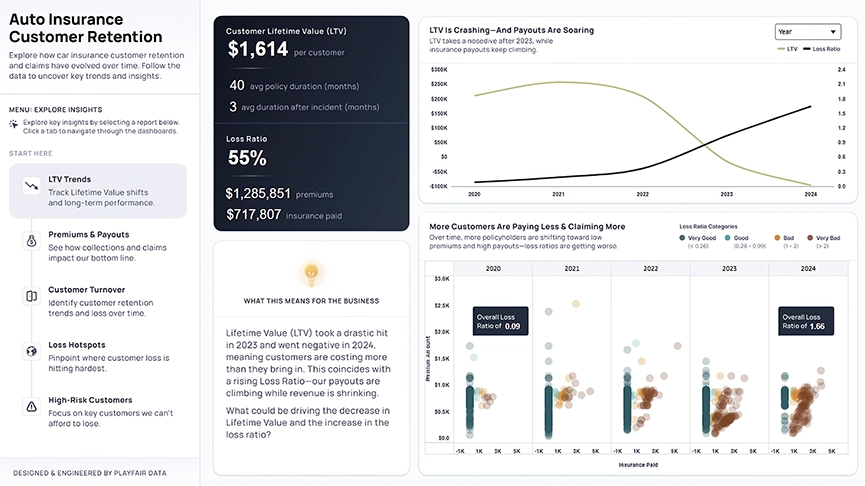
Auto Insurance Customer Retention
We chose the auto insurance data set so that we could apply our expertise to business analysis.

Wildfire Tracker
I wanted to predict wildfire incidents to help first responders anticipate future incidents and more effectively allocate resources.
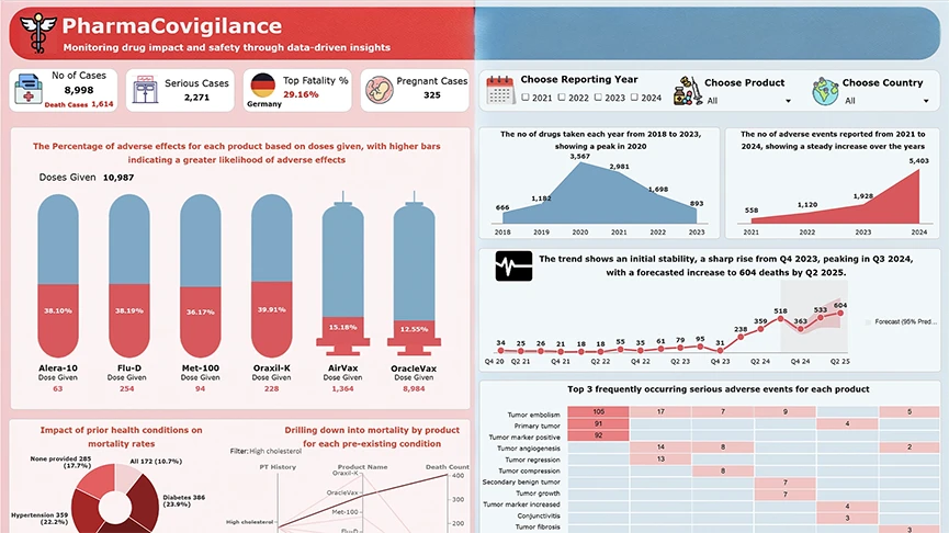
Pharmacovigilance
I chose pharmacovigilance as my subject area because medication safety is a critical global concern.
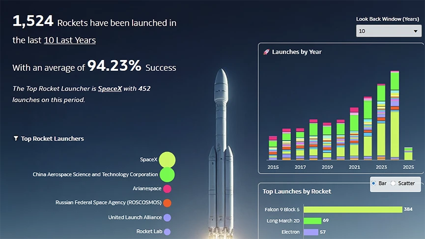
Space Launches
I chose space data because I’m passionate about space exploration; space activity is accelerating rapidly, with more launches than ever before.
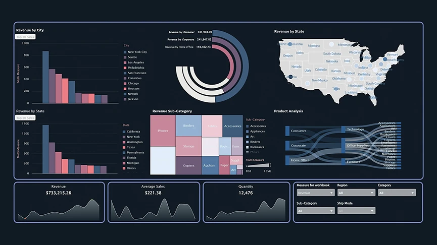
Sample Superstore Sales Analysis
I chose the sample superstore data set as a subject area because it allowed me to explore various aspects of revenue performance and profit analysis.
 See all winners in the Data Visualization Challenge ebook
Learn more about the challenge, how the participants created compelling data visualizations, and find out how you can join next years’ challenge.
Winners gallery
Check out the winners of the 2024 challenge in the data visualizations gallery below. See how they were able to create impactful data visualizations using the tools and techniques available in Oracle Analytics Cloud.
-
Formula 1—Drivers face to face
Carlos Megía Tarín, ClearPeaks
We wanted to provide meaningful data for both fans and non-fans of the sport.
-
Life Sciences: Patients Dashboard
Debasmita Das, Accenture
The data visualizations in this dashboard provides a comprehensive overview of a patient’s critical medical information.
-
Safe City Project
James Lomotey, Prudential Bank
I believe that data-driven approaches can make a significant difference in reducing crime and improving public safety.
-
Esports Driver Comparison
Philip Godfrey, Vertice
We chose esports data because of the sheer volume and velocity of information generated.
-
Sales Analysis Report
Sowmiya Ranganathan, OneGlobe
The data set used can be leveraged across various retailers to understand how sales are impacting their growth.
-
Attrition Pulse Newsletter
Anisha Patra, Oracle
Attrition is the quiet pulse of every organization; it speaks volumes, even in silence.
-
Chronic Kidney Disease Detection Models
Emily Liu, Oracle
I hoped to show how machine learning is useful in predicting conditions in a healthcare environment.
-
Jack and Rose on Titanic—Atlantic's Eternal Tale
Gautam Pisharam, Oracle
I chose this subject because it combined my love for history, geography, storytelling, and mapping.
-
Spending Analytics Report
William Wandurraga, Oracle
I want users to be attracted to my visualization design first so they can explore data that is important to them.
“A good data visualization, at its most basic, is any visualization that first of all reduces time to insight. The data is trying to say something. It’s just a matter of surfacing that story.”
“We wanted people to see more than just stats—to connect with the stories behind the data and understand the performance of each driver in a more engaging way.”
“By clearly showing trends in adverse drug reactions, I aimed to support better decision-making in healthcare, ultimately helping reduce harmful side effects and improve treatment outcomes for patients around the world.”
“I enjoy displaying numbers and figures in more beautiful way. Mostly, I like the creative part that goes behind the scenes.”
“Without visualization, data has no meaning. For the complex organizational data that gets accumulated in the source over years, data visualization provides actionable insights and helps in better decision-making.”